Brewed in accordance with Reinheitsgebot, the German Purity Law of 1516, the Beck's Vier brand is well known for its uncompromising quality. Recently, working with the Beck's Vier brand team and Bloom, its appointed design agency, the team at ADS2 Brands delivered a new bespoke beer font which reinforces the lager's unshakable commitment to heritage and superior brewing.
ADS2 has been lucky to be involved with the Beck's Vier proposition since its launch as a brand new product in 2006.
Our involvement since the beginning has allowed the design and engineering teams to explore and enhance the proposition in partnership with multiple creative agencies and the brand team.
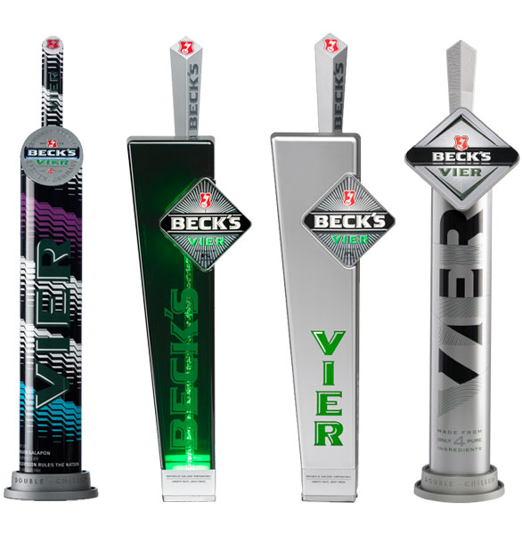
The relationship with the Beck's Vier Brand has seen the evolution of the brand in many stages. From the first design iteration of a radical font, designed to deliver a singular proposition for the Beck's Vier brand whilst minimising tooling and investment all within a timeline that we were told was impossible – exactly the challenge ADS2 rises to.
From the first concept in January 2006 we engineered, developed and created a unit that was delivered at the end of March!
ADS2 did not compromise on innovation due to the tight timeframe within the font was a new cooling system that delivered condensation to the external body. This cooling system delivered a 40% reduction in heat-load on the python a real innovation in a market with many flooded brass fonts!
With the launch successful ADS2 and the Brand team embarked on a relationship that explored and delivered the evolving proposition for the Beck's Vier brand and equally importantly the evolving marketplace over the years.
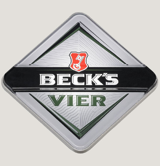
In 2016 the providence of Beck's Vier was the focus – the Brand had been built from its adherence to the Reinheitsgebot purity law of 1516, purity, honesty and quality.
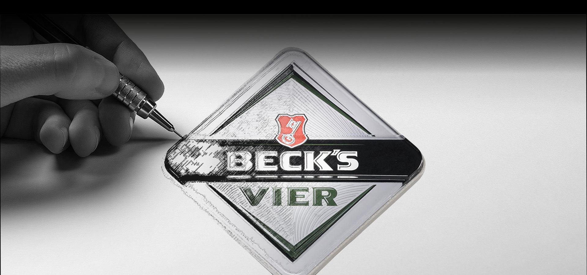
Beck's Vier respected this. 'Vier' (which means 'four' in German) refers to the brand's alcohol percentage and to the four ingredients rule allowed for under Reinheitsgebot; hops, yeast, barley and water. The aim of the new font is to ensure consumers are aware of the pioneering story behind the brand and the quality of the lager that is produced. With a bold new look, the font stands proud on the bar, engages with consumers and speaks clearly about the brand and its quality ingredients.
Taking the 2006 font as the starting point and refining the innovative decoration techniques developed for the limited Edition fonts, ADS2 and the design agency Bloom were able to explore, refine and deliver a bold new position for the Vier brand with limited investment and lead-time.
Heritage, Purity, Quality and Pioneering Spirit are now presented as a single Brand Essence; within a Design Intent that is bold and has great present on the bar.
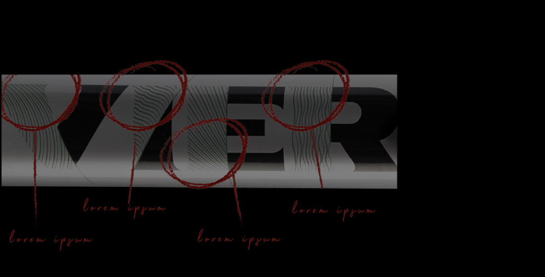
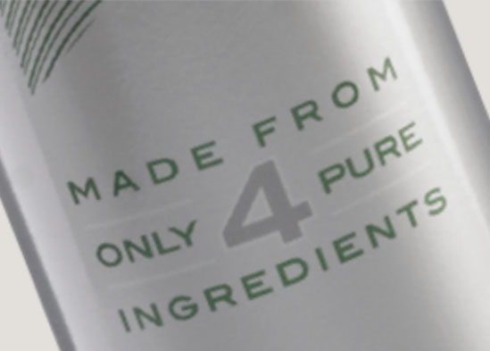
The main body of the font highlights that the lager is brewed using only four pure ingredients. Bavarian hops for the perfect aroma; golden barley for a rich, rewarding, full bodied flavour; yeast to create the distinctive Beck's beer taste; naturally filtered water, for a smooth crisp finish.
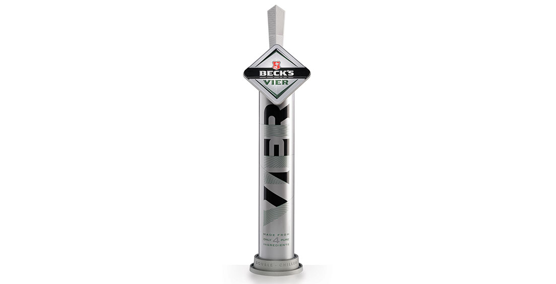
Each ingredient has its own iconic pattern, which are interwoven into the main Vier branding and replicated on the font's bespoke tap handle. So that we could use existing components form the previous Beck's Vier font, a key requirement of the brief, we used high impact vinyl prints to wrap the main body. Similar to those used within the automotive industry, they are applied by hand and offer a seamless and highly robust finish for life in-trade.
Our in-house print division also created a new illuminated lens using a combination of block foiling, embossing and debossing finishes with matt, satin and gloss varnishes to deliver a powerful 3D effect.
Branding and the Reinheitsgebot proposition are communicated and carried within the decoration of the new Becks Vier font. Within this decoration is a mnemonic pattern that is harnessed across the entire portfolio for Becks Vier in the on-trade arena.
We have been privileged to work with Beck's Vier since its launch on draught in the UK and Ireland, producing a range of bespoke fonts and tap handles. This latest development articulates and expresses the essence of the brand, its values and USPs in a way that's both design-effective and cost-effective.
