Here we were given the challenge to work on the strategic brief and develop a new font branding proposition for the Magners Brand; key to the development of the strategic vision was the requirement that any design should have close to zero CAPEX investment.
With this a starting point ADS2 worked to develop the creative and technical brief a document based upon understanding of the Brand developed over the relationship with C7C and an understanding of what could be delivered within the commercial constraints established.
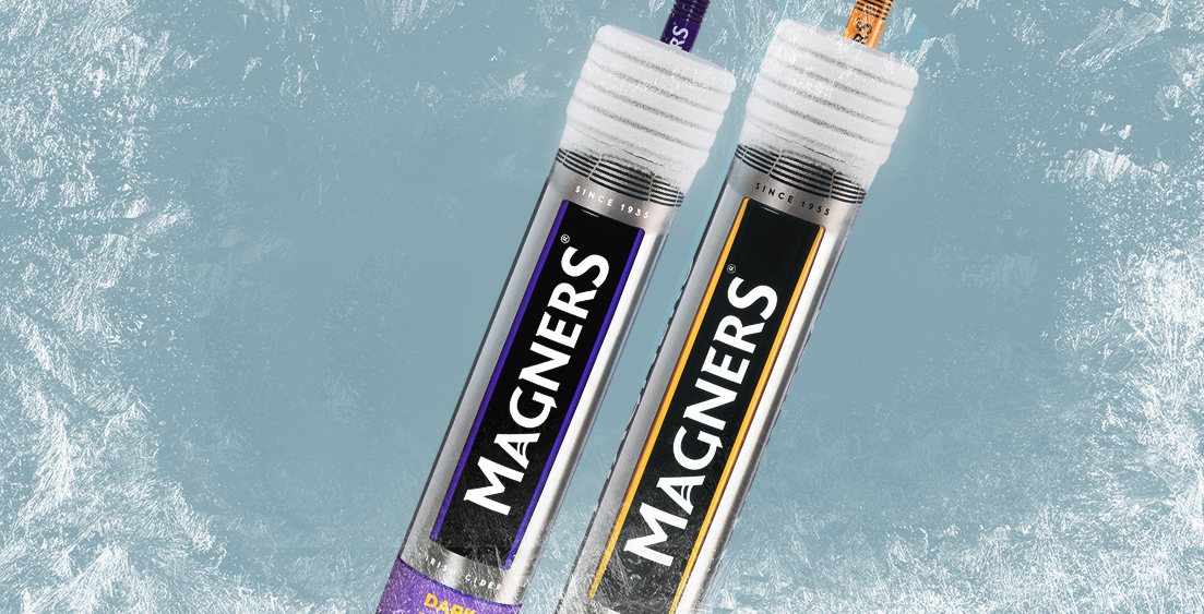
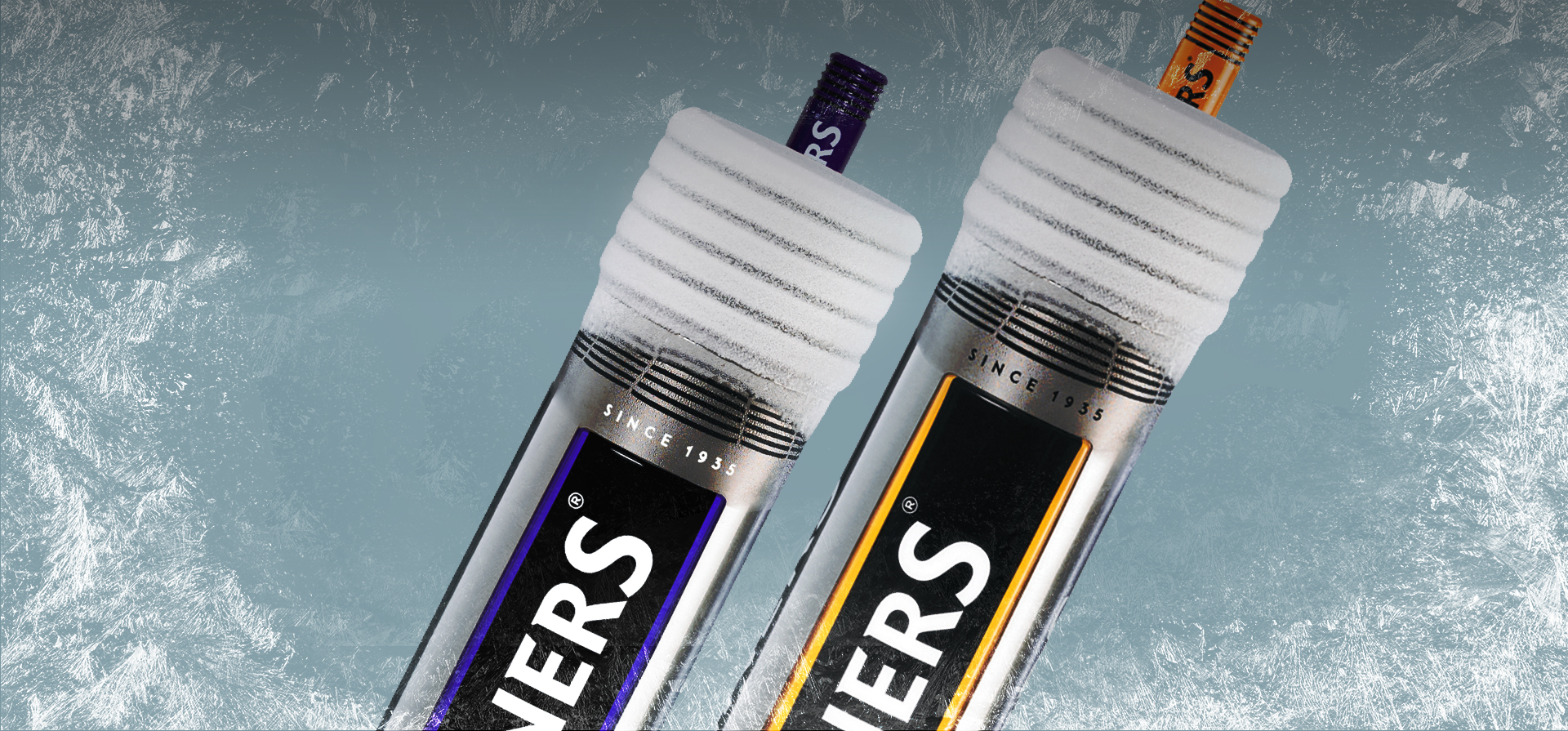
ADS2 presented a series of design concepts that expressed the Magners proposition in different ways; the concept named Beacon was the successful candidate from this early creative phase. Within the design intent there were some simple innovations the main one being
'THAT SOMETIMES LESS IS MORE'

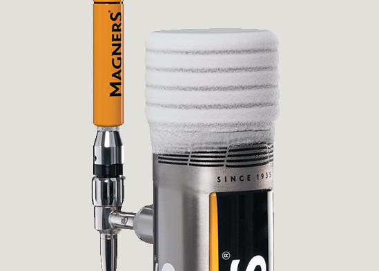
The concept used Peltier icing technology but in a far more subtle way, rather than creating a font with a mass of ice covering the unit we chose to only ice the top cap. Tis created a far more premium proposition and allowed for a far more energy efficient environmentally friendly solution to be delivered.
The top cap was a machined component the body a fabricated laser cut tube the main lens produced in-house. All of these components incurred zero tolling investment.
When these fabricated and machined components had been decorated the visual impact of the font communicated the brand proposition completely.